If you’re thinking about driving more traffic to your website, there’s no better way to start than by making a well-designed, professional homepage.
Your homepage is the face of your website. Make it attractive and pleasing to the eyes and you’ve won your first victory: having your visitors click on page 2.
However, this isn’t always the case. I’m sure you’ve visited sites that don’t deserve a second look. They’re everywhere!
So in this article, we’re going to look at 3 common web design mistakes most businesses commit when building their homepage.
First, we’re going to talk about the lack of information. Next, we’ll discuss the lack of coherence. And lastly, we’ll go in depth on important components amateur websites are missing. After reading this post, you will be able to improve your website’s homepage so you can drive more traffic to your website and attract more customers to your business.
1 – Lack of information
Once on your site, the first question your visitors ask is: “Am I on the right page?”
Pretty obvious, but most owners are still guilty of not giving away enough information about their business or site.
What they do is make their message ambiguous, self-serving, or confusing. Such websites display headlines that spit corporate jargon all over the place:
"A full-service company with social media integration and enhanced state-of-the-art analytics."
"Offers cloud-backup service internationally. Fast, reliable redundant architecture with 24/7 customer service support."
"A world-class multimedia platform with award-winning team of industry experts."
Sound familiar?
Yes, that’s because every business around the world has written the same, old taglines one way or another.
And to stand-out from the competition, your message has to be unique, specific, and centered around your customers.
[clickToTweet tweet="Your message has to be unique, specific, and centered around your customers." quote="Your message has to be unique, specific, and centered around your customers."]
In general, your homepage should tell people 3 things:
- Who are you?
- Who is your customer?
- What benefit do you offer to your customer?
That’s it. You just add more to emphasize these 3 key points.
Take a look at this example:
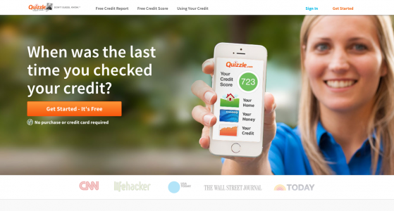
First, the name is well above the fold. Then, it talks about credit score as indicated by the graphic and a big headline – telling us who are the target audience. Lastly, it gives a benefit: FREE credit score and credit report delivered straight to your inbox.
2 – Lack of coherence
The font, color, and overall design of your site speaks well about your branding. I’m not saying that you should be boring and ban creativity from your design. What I’d like to propose is stick with a central design that best reflects your company. 2 to 3 typefaces is enough; while 2 to 4 color palettes gets the job done. Position the elements (E.g. sidebar, navbar, and footer) on places where they’re supposed to be.
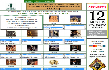
Don’t fall into the trap of giving yourself leeway to experiment on design to your heart’s content. It makes your visitors confused and turned-off:
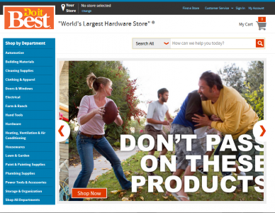
Always choose consistency and cohesiveness to drive your message across. Your customers will appreciate it:
3 – Missing elements
Don’t leave your clients guessing and figuring out everything themselves. It’s important to at least give your contact information, a list of your services or product, a call to action button, and a search bar for quick navigation. Putting your clients in a confused state makes them frustrated…that’s the last thing you want.
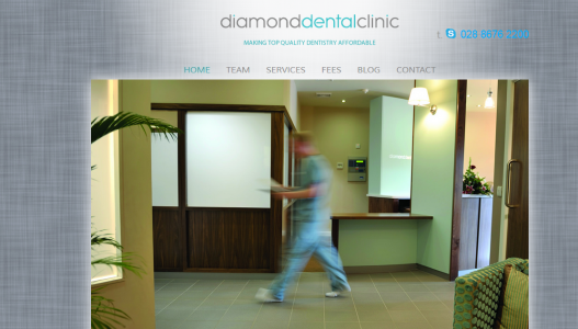
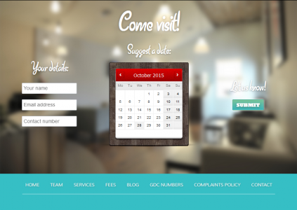
Always guarantee a good user experience by providing all the features your customers need. For example, a dental clinic should at least give a link to their services and a contact information. A good example is Diamond Dental Clinic. Take a look at their homepage:
Plus, the site can schedule your visit via an on-site booking form found on the homepage itself:
Conclusion
Learning from these 3 mistakes allows you to follow proven design principles that work well on big-time businesses. Do yourself – and your clients – a favor by understanding these basic concepts. Remember, there’s a reason why high-traffic websites enjoy hundreds even millions of hits per day: they don’t make the mistakes small-time websites do.
And if you want a quick, professional assessment of your site, you can always reach out to me. I’ve worked with both Enterprise and SMBs on their web design projects.
I empower businesses and marketers to create automated content systems that elevate sales and delight customers. Here’s how it works.