Are You Dying to Build Your Website? First, know the difference between wireframes, mockups and prototypes.
Wireframes, mockups and prototypes: What goes where? Which one is more important? What to do first?
Do you even know the meaning of these words?
Maybe you’re wondering what goes inside the war room when designers and stakeholders talk about these terms.
Well, it’s time to take a closer look.
In the world of web design and development, you’ll always hear these words. Which means they're important. And why not? These are the foundation in which all websites stand.
To make it simpler, web design and development is like building a house – you start with a blueprint, then the scale model and lastly the finished product. Your site is your home on the internet. The principles that work in building a house apply to websites as well.
Make sense?
Let’s find out the difference between wireframes, mockups and prototypes. Discover why and when you need each one of them when building your website.
Wireframes
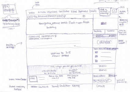
Wireframes show your site’s physical layout. Just like blueprints, wireframes indicate the position of each content (e.g. header, text body, call to action, squeeze page, menus, etc.) on every page. Wireframing is as traditional as using a pen and a paper. It can also be as modern as using Balsamiq. Usually in gray, black or white motif, wireframes focus on the structure rather than on the aesthetics. Sometimes, blue is added to indicate a clickable element.
Why use wireframes?
Use wireframes to see how each element fits into the layout. And to highlight the site’s structure and important contents.
For example:
A writer would like to display his latest blog post in the center of the home page. A photographer might place her portfolio in the upper right corner just under the headline. A non-profit organization would like to put a 44 x 44 pixel call to action box on the upper left. An online marketer would like a 400 x 300 pixel call to action box on the right side of his sales page.
When to use wireframes?
Ask for wireframes when you need to see the initial draft of your website. And it happens on the planning stage. Wireframes organize thoughts by putting ideas into writing. Just like a script or a sketchpad, it serves as the project’s documentation. You can see the specific length, width, label, position and a description of each element. And because it is static, team members can always go back and refer to it. Wireframes are useful for collaboration and brainstorming.
Mockups
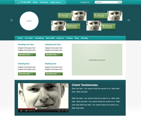
While wireframes are sketchy and dull, mockups are vivid representations of your website. With mockups, you can see how the elements look like with colors, fonts and themes. You can say that it is the website minus later revisions. Usually, designers create mockups using Adobe Photoshop or Fireworks. Head to Adobe web design blog for more ideas.
Why use mockups?
Mockups are important to seal the deal. Your site must appeal to your senses. You should already know what your site looks like given the right typography, the ideal color and the exact dimensions. Of course, this is also your chance to check for design flaws. You could also ask your designers if they include mockups as add-ons to their proposal
When to use mockups?
Mockups are valuable when discussing about the overall look and feel of your business’ website. After completing the site’s layout, the first order of business is to come up with a good set of mockups. The contents should stick to your preferred font, theme, vibe and color
Prototypes
Wireframes indicate where the elements are supposed to be. Mockups guarantee that the content is appealing. Prototypes make sure that your site is working.
To explain further, wireframes are the templates in which the designer base the pages of your site. Whether the designer uses the same template or not, prototypes must link these pages together. Successful prototypes send the visitors to the services page when they click the “Services” button – not to the “About Us” page.
Prototypes answer the following questions:
- How the applications work in a living, breathing site?
- How do users interact with my site?
- What does my site look like when I key-in the URL?
Just like a model house, a prototype ensures that each facilities are working.
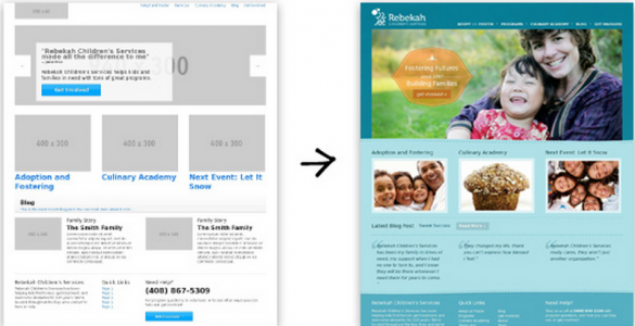
Here is an example of a prototype using Foundation -- an interactive framework that works in a web browser. This prototype is for Rebekah Children's Services, an organization that helps with adoptions and takes care of disadvantaged kids.
Why use prototypes?
Get feedback from users – Did they enjoy the site? Did they experience hang-ups? Did the buttons bring them to where they want to go? Collect user feedback so your designer can adjust accordingly.
For testing –Does the site have dirty codes? Is it bug-free? Does the site follow the parameters you set? You have to test until you have satisfied the conditions.
Save time and money - With prototyping, you save money from applications gone wrong or ill-fitting architecture (e.g. Database, application and web server). If everything goes south, developers can QUICKLY adjust without compromising the development cycle.
When to use prototypes?
Prototypes are for testing prior to the actual development of the site. This is the dress rehearsal. You iron out all the details that might cause a bad user experience.
To sum it up, a wireframe goes first, mockup second and prototype last. Going back to our analogy of building a house: a wireframe is the blueprint or the layout; a mockup shows you how a house looks like when color and motif were added; a prototype is the model unit that lets you experience how it feels like to live under it.
All of them are important in making sure that you have a well-functioning, beautiful website.
Featured Image: "Wood-framed house" by Jaksmata - Own work. Licensed under CC BY-SA 3.0 via Wikimedia Commons - http://commons.wikimedia.org/wiki/File:Wood-framed_house.jpg#/media/File:Wood-framed_house.jpg
I help businesses and marketers build marketing and sales systems that drive leads and scale with ease.
Not sure where to start? Take my marketing quiz and get personalized next steps.


