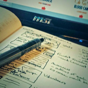
Cure: blood cancer is a non-profit organization based in Canada that raises funds to help find a cure for blood cancers, including those such as leukemia in kids. Cure asked me to design some banners via Fcancer, a site to donate professional service hours to cancer foundations.

The idea was to use statistics and information from their first year in operation to create a series of related banners. These would be used on their website and social media, such as Facebook. Cure wanted a look that was like Fcancer, with a clean, modern and flat design.
In my mind I saw all the banners having a similar feel to them, with a limited palette of colors, and using typography and few design elements. I liked the idea of using vectorized images as backgrounds, and alternating the text from left to right. This would allow them to stack for use as a poster if needed.
Cures colors were already blue and red, red in the logo and blue on the website. The contrast between the blue backgrounds and black overlays meant the red pops, leading the viewer from the banner subject to the information. To be honest, I took some influence in the colors and design from a board game my husband and I were often playing at the time.
Here are some examples of the banners I created.

