Using SumoMe for Growth Driven Design
A couple of months ago, we discussed Growth Driven Design and why traditional web design is becoming outdated.
As a summary, Growth Driven Design or GDD is a two-tier program that allows you to test, learn, and apply new design principles based on your customer behavior.
With GDD, you would be able to:
- Deliver timely, relevant content that understands your market
- Increase your retention rate because people are hooked on your content
- Maximize your site’s features while continually improving your services
- Be ahead of your competition who are stuck with traditional web design models
- Rank better in search engines due to good, quality content and improved user experience
Now, I’m going to share with you how I use SumoMe to implement GDD. SumoMe has a total of 12 tools to build your list, optimize your analytics, and share your content. I've focused on four tools to enhance my client’s services and rankings. I also employ these features to grow my own list and optimize my site:
- Heat tracking
- Sharing articles on social media
- Content analysis
- Scroll box
Use Heat tracking
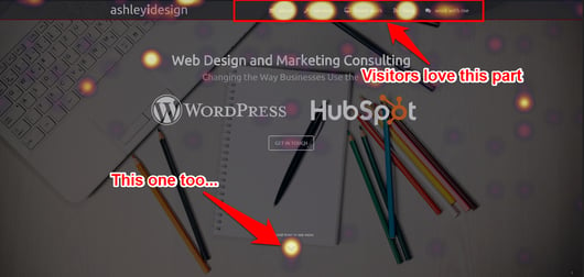
When I run Heat Tracking, I can see which parts of the site get the most clicks – and which ones don't. For example, if a lot of people are clicking on a client's blog link from the homepage, I would create a section to showcase some content from the blog. Likewise, if the “Download” button doesn’t get enough love, I would make it standout or ask my client to create a better offer so people will be enticed to buy.
Heat tracking comes in handy when I’m redesigning my clients' sites. All I have to do is run this tool, leave it for 10 to 15 days, collect data, and build a new, upgraded layout. I was able to improve the site’s navigation and funnel visitors to relevant content.
Notice this heatmap on my site:

If I didn't have this data, I would have thought that the "Work With Me" tab was doing just fine. But what this heatmap suggests is that people would rather look at my blogs and my services before getting in touch with me. Take note that I included a scroll-down button. I'm implicitly telling visitors that "there are more surprises below... here, click the scroll button." It works judging by the heatmap it produces.
If you're planning a redesign, a heatmap is a good reference on how to layout each component of your site: buttons, calls to action, texts, images, and more.
Enable article sharing on social media
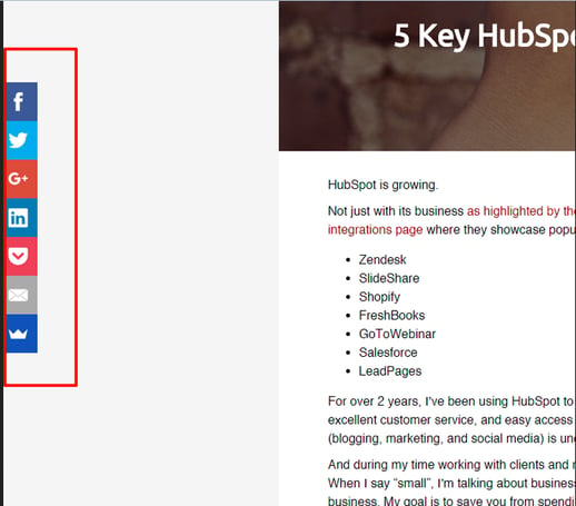
Your site must be ready to serve your customers' need for shareable, viral content. Whether you’re in the B2C or B2B market, your content has to reach as many customers as possible. SumoMe’s sharing tool allows my clients to create content and share it to major social media channels in an instant.
Plus, the tool is mobile-friendly. So whether my clients are at the office or in transit, they can share their most recent posts:

I make it a point to study how my clients share their content.
Are they using Twitter more and Facebook less? Have they got an RSS feed somewhere? When checking on the heatmap, which button gets the most click... is it Facebook, Twitter, or LinkedIn? From this data, I can arrange the Share Content menu to highlight the most favorite social media icons.
Perform content analysis
I used to think that all visitors enjoyed my content.
I was wrong.
Upon using Content Analysis, I discovered that most of them – around 75% – don’t finish my articles at all.
With Content Analysis, I can tailor-made my content based on my customers' behavior. I can trim the fat and leave the meatiest information so people are excited to consume my articles.
I recommend Content Analysis to my clients so they’ll know how far they should go when writing their posts. Sometimes, I even ask them to create a series of articles instead of writing a longer one.
Use Content Analysis to study your customers' behavior toward your content. Find out if they’re bouncing off halfway through your post. Study the average length visitors stay on your article. This will help you decide whether to split your article or include an opt-in form in the middle of your post. So even if they don’t finish your article, you’ll be able to capture leads by getting your customers' email addresses.
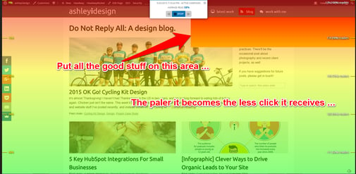
As an illustration, the upper-right corner of my blog gets the attention. It tells me that people aren't looking to scroll down and explore my list of blogs. They want to get into the meat of my site: Services and Latest Work.

If you're designing your site, use Content Analysis to tweak your content in such a way that you can showcase it better. For example, you could put the latest blog articles around the right side including your contact form. See if it improves your conversions.
Create a scroll box
So how do you push for a sale without being “pushy”?
Use Scroll Box.
I always tell my clients that the years of interruption marketing are almost over. Customers are smart these days. And they demand respect. When redesigning a website, I first look at how my clients get their leads (I.e. the opt-in form). For me, an opt-in form must be intelligent enough to know when, where, and how to show up – or risk the likelihood of being ignored.
Fortunately, you can customize Scroll Box to adapt to your customers' behavior, plus, it’s mobile-ready – perfect for customers who are always on the go.
Is Growth Driven Design perfect for your business?
Growth Driven Design is all about recognizing your customer’s behavior and implementing actionable steps to satisfy their needs:
- Can they share your content even on their mobile phone?
- Are they more attracted to an orange “Buy Now” button instead of a red one?
- Does a 500-word article interest them?
- Do they hate loud, flashy opt-in pop-ups?
I could go on and on. But what I’m trying to point out is this:
Once you've gathered enough data to predict your customer’s behavior, you’ve got to have the best tool to implement your findings. And based on my research, SumoMe meets my qualification.
It’s easy to use – even for non-techie people. The data are as comprehensive as any platform – even better with the Pro version.
Growth Driven Design is the future of the Web. Smart, agile, and practical, it guarantees high traffic volume, increased visibility, and continual growth without the pain of expensive, cumbersome platforms.
You can always try different tools to gauge your customer behavior. Or you can take my personal guarantee:
Once you tried SumoMe, you’ll never look for anything else.
I’ve been using it for almost a year and my clients are satisfied with the results.
I empower businesses and marketers to create automated content systems that elevate sales and delight customers. Here’s how it works.

 Want to learn more about Growth Driven Design?


