
Web Design Principles to Improve Conversions: Part 1
“It’s so clinical, so pasty, lots of white, lots of pale blue obviously trying to be gentle on the eye” (Female, 48 years old, verbal protocol)
“The banners, when they are trying to sell you something or click down here for your free whatever, you just get turned off” (Female, 49 years old)
“And one of them I didn’t like the colour of. I couldn’t wait to get out it was an insipid green backdrop it just put me off reading it” (Female, 53 years old)
These quotes came from an experiment conducted by a group of psychologists. Their report, “Trust and Mistrust of Online Health Sites”, told how fifteen women, faced with risky health decisions, had to find information on online sites. During a four-week experiment, these ladies had to search for sites they deemed trustworthy.
The report revealed primary factors relating to the rejection and mistrust of websites.
94% of the participants said that their mistrust stemmed from:
- Inappropriate name for the website
- Complex, busy layouts
- Lack of navigation aids
- Boring web design, especially use of color
- Pop up ads
- Slow introductions to site
- Small print
- Too much text
- Corporate look and feel
- Poor search facilities/indexes
6% of the participants said their reason for rejecting a site was “irrelevant or inappropriate content.”
This statement sums up the whole experiment:
“The look and feel of the website was clearly important to the participants. Visual appeal, plus design issues relevant to site navigation appeared to exert a strong influence on people’s first impressions of the site. The poor interface design was particularly associated with rapid rejection and mistrust of a website. In cases where the participants did not like some aspect of the design, the site was often not explored further than the home page and was not considered suitable for revisiting at a later date.”
As web users ourselves, we can relate to what these ladies have gone through. It doesn’t take a rocket scientist to tell us that a website like this deserves the back button:
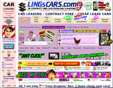
So, what makes a good web design? What does a high-converting web site look like?
My aim is simple: show you how the big boys are racking up on sales by doing the right things. And, by exposing these principles, you will have a chance to improve your own website as well.
Because I want to give you detailed insights on how everything works, I decided to split this into two articles. In this post, I’ll discuss working with above and below the fold. I will also give examples on how to work with whitespace to make your site look professional.
Working with “The Fold”
“Above the fold” is the upper-half of a publication (e.g. Newspaper, tabloid or magazine) that buyers instantly see. Since the early days of newspapers, publishers are putting great efforts to place the juiciest articles above the fold. And this can be said about sales letters as well.
David Ogilvy, “The Father of Advertising”, found out that only 20% of people read past the headline. He also noted that, “… readership falls off rapidly up to 50 words of copy, but drops very little between 50 and 500 words.”
Applying the same idea in your website will put your call to action “well below the fold even at full-HD resolutions,” according to Kissmetrics.
So, what should you put above the fold? Consider this design from BedrockData:
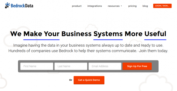
Right off the bat, you’ll see the headline and sub-headline, a call to action, the offer and a sign-up form. In fact, you don’t have to scroll down to figure out what the site is all about.
Although BedrockData’s design works well for most websites, others might find it a little bit “forced”. Putting all information in one place leaves little breathing room; especially for someone who sells a complex product.
If that’s the case, consider this website from Toast. This is an example of someone who takes advantage of its page length to draw readers all the way below the fold:
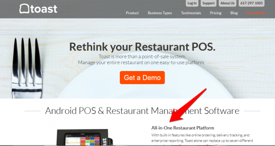
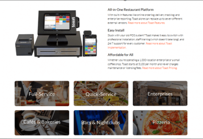
Notice how subsequent content peeks out to entice scrolling. Content below the fold reveal other sets of information like features, benefits, calls to actions and a set of images to help potential customers determine the right services for them.
Based on both examples, it’s safe to say that everything depends on the nature of your product. Does it serve a wide range of market? Does it need an in-depth explanation? Can your target audience understand your value proposition even without scrolling down?
Don't be afraid to work your way down to explain your products or services. If your headline did what it's supposed to do, your prospects wouldn't mind at all. Put visual queues that lead to even more content below the fold. And if they do scroll down, reward their effort by making sure your content rocks.
Whitespace brings balance
“Extremes are easy. Strive for balance.”
- Colin Wright
What would you feel if you see a website that claustrophobics run away from?
You know what I mean: sites that have no respect in spacing, have no regards in proper layout and had thrown away a sense of measurement. Just like this:
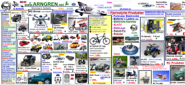
I get it.
Content will always be king. And you’ve gone to great lengths just to have your voice heard. But in between those jabs and hooks to drive your message home, there will be times when you need to stop, settle down and breathe.
To let your visitors figure out what’s going on. To let them look at each element as something beautiful and functional.
This is the benefit of whitespace – a portion between elements left blank for design. Whitepace or negative space allows visitors to navigate your site without things getting in the way. Consider this design for SessionM:
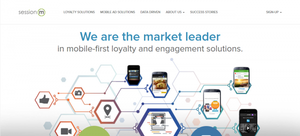
Each component is separated from each other. These separations make each element stand out, making them visible to users. There is no clutter and you can figure your way around it. And if you’ve noticed, they highlighted the “sign-up” button by moving it farther to the right corner; producing a wide space in between.
Please note that a negative space doesn’t come in white or in plain colors only. Using a background image is fine; just like this one from Recurly:
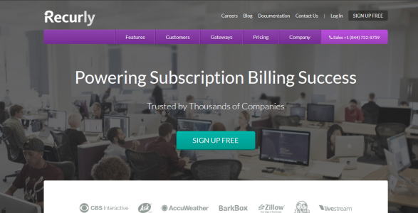
They’ve used extra padding to isolate the “sign up” buttons located above the menu bar and in the middle. The spaces on both sides create an overall balance to the home page.
Balance is important when putting content into a canvass. It doesn't matter what you choose as your background as long as each content shares the limelight.
In Summary
There is no hard and fast rule that says you must squeeze all your content above the fold. Yes, 80% of visitors judge your site based on what’s found above the fold. But, it shouldn’t stop you from making the most of your site's real estate. Smart planning and understanding your market are still the best ways to work with your web design.
Working with whitespace is important if you want your market to take you seriously. Remember, you only have at least 5 seconds to make a good impression. Make the most out of it by carefully planning the layout of your content.
In the second part of this series, we’ll discuss the use of fonts and how to find the right mix of colors to apply to your web design. We will also take a look at how visitors scan your website and how to benefit from it. I’ll give you examples and web design tips that you can apply immediately. See you next week!
I empower businesses and marketers to create automated content systems that elevate sales and delight customers. Here’s how it works.


