

Update: Now live! See the official announcement here.
Mobile users must be jumping for joy!
Google has heard their plight for a more responsive, unique and enjoyable internet experience. And because of these needs, Google decided to make a “significant impact” on their search results. Here’s a portion of Google’s announcement on Webmaster Central Blog last February 26:
“Starting April 21, we will be expanding our use of mobile-friendliness as a ranking signal. This change will affect mobile searches in all languages worldwide and will have a significant impact in our search results. Consequently, users will find it easier to get relevant, high quality search results that are optimized for their devices.”
If you’re a business owner who doesn’t know – or care – about these changes, watch out. Google’s decision will have a big impact on how you market your business online. This article is for you.
What is Google's mobile-friendly algorithm?
Until recent years, clients exclusively use laptops and desktops to search for your business. Via your social media manager (or even you), you always make sure that you’re on the first page. And we all know why it’s important, right? Being on the first page means clients will most likely visit you than your competitors. Instead of dealing with competitors, customers would rather have you.
All is fine and dandy. Your business is chugging along while visitors are increasing.
Suddenly, things got tricky when the same people started to search you on their mobile device. You didn’t expected it. Your clients started to complain: small fonts, unclickable links, tiny images and slow website.
And you’re not alone. Basekit, a cloud-based website builder, released a report showing 91% of SMB websites are not mobile-friendly.
Google decided to have a major shake-up of its algorithm. It’ll favor sites that perform well and look good on mobile-devices. It hopes to improve user experience on all devices. And what’s the reason for this improvement in your business? Read on.
Why you should care?
According to a report by CNN Money, mobile apps had overtaken PC on internet usage in the U.S. Think about it. You are losing a big slice of the market share if you’re not mobile-ready. Why? Because even decision-makers rely on their mobile device to make their next big purchase. Consider this study by IDG Global Solutions entitled “Evolution of Business: The Mobile Executive”:
- The majority of senior executives (92%) own a smart phone used for business.
- 77% of these executives use smartphone to research for a product or service for their business.
- 50% of these executives purchased IT products using their smartphone.
- The study showed that these executives use smartphones for business-related searches even after office hours (during the commute, evenings and weekends).
Here’s the big question: How many of these decision-makers, influencers and customers go to your site? A few? Most of them? None of them?
What if you don’t act NOW?
Here’s the truth if your site is not mobile-friendly: Google WILL penalize you. Let’s say that for the longest time, your site ranks number one on Google search. Come April 21 (the date when the algorithm will take effect), you’ve refused to make changes. You stood pat. Once the crawlers found out, and they will, you’ll drop down from the rankings.
With less searches means less visibility. With less visibility means less relevance. Less relevance means less potential sales. Don’t let this happen to you. You must take action – ASAP – if you don’t want to be demoted.
Now, what to do?
Fortunately, Google offers guidelines on how to make changes on your site. Here they are:
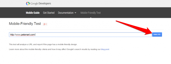
Check your site’s “mobile friendliness”
This app will help you check your site for errors and violations relative to the new algorithm. Simply go to the Mobile-Friendly Test link, paste your URL and click “Analyze”:
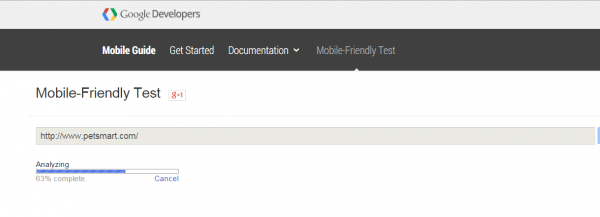
Wait for Google to finish analyzing:
If your site is mobile-friendly, you’ll see this message:
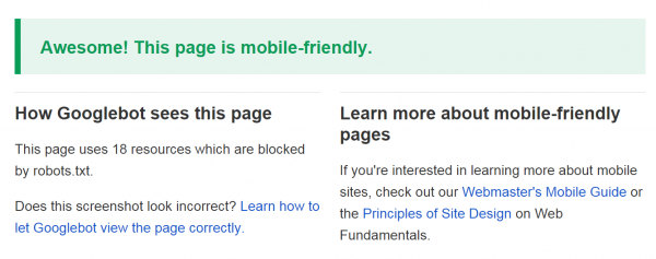
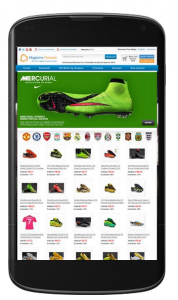
It will even show how your site looks like on a mobile device:
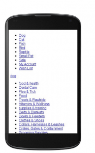
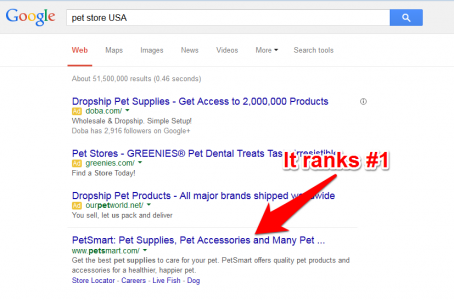
And yes, Google loves this pet store. See the rankings:
And what if Google hates your site? Here’s what the report reads:
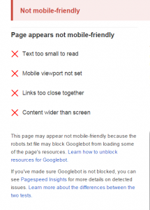
This is how your site looks like if it’s not mobile-friendly:
Customize your website software
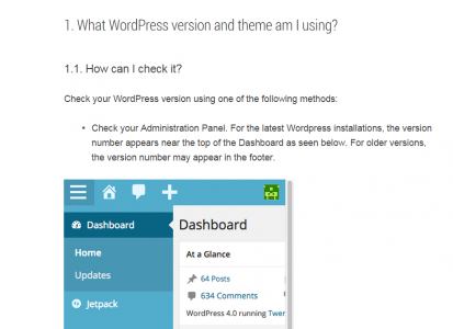
Joomla? Wordpress? Drupal? Blogger? Your site’s searchability depends on how you dress it up. Ask your developer about the software package your site is using. Google has a list of guides to make your software site adhere to the algorithm. For example, here’s a screenshot of a guide for Wordpress sites:
Implement mobile SEO best practices
Are you practicing correct SEO? Are you even aware of the rules for making your site searchable? Do you know the words or phrases your prospects use to search your businesses? If you are faithfully following Google’s SEO practices, there’s no doubt about your business ranking high.
Now that you’ve taken steps to be mobile-friendly, you may be asking: “What’s in it for me? Why the trouble of doing all these things?”
Good question. Here are the answers.
The Four Benefits of making your site mobile-friendly
Search Engine Journal posted the four benefits of a responsive web design. Responsive web design (RWD) means you make your site perform well and look good on different platforms (e.g. Mobile, laptop, tablet or desktop).
Here are the benefits:
One website, one URL
Traditionally, you build a separate website to make your business searchable on mobile devices. Your problem: creating another campaign for mobile users. This means, double the effort and the expense of doing the same SEO process. This may sound practical if you’re running a big news organization. Usually, these companies have a separate mobile news site. But if you are an SME who would like to maintain the same content, why bother? With RDW, you maintain backlinks going back to your site. Additionally, you drive new links BOTH from mobile and traditional users to ONE domain.
Google loves responsiveness
If you want to rank high, make it easy for crawlers to find you. Crawlers can index your contents, pages and files better if they are located on a single URL. This means that your users can easily find, share and link your content on any device. And that’s what you want for your business: word-of-mouth marketing. Simple. Free. Easy.
Combat high bounce rate
If your site does a poor job on mobile devices, visitors will get turned-off easily! And you don’t want that. As much as possible, your visitors should stay longer, search deeper and feel better on your site. High-bounce rate – relative to bad user experience – means lower Google ranking.
Enhanced user experience
You’ve made your site mobile-friendly (or responsive). You've attracted Google to index your site favorably. You've made visitors stick longer. Now here’s the best part: you've created an amazing user experience. People will start to share your contents to their friends. Prospects will start using your app because it’s fast and fun. Business owners will love to transact with you because your site is available 24/7. Your business will start to boom, and you’ll outrank the competition.
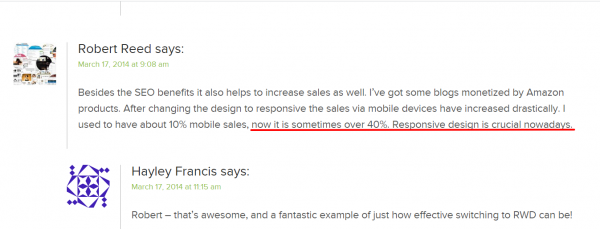
Finally, this is from someone who made his site mobile-friendly and became successful doing it. His name is Robert Reed, owner of WPThemesBay.com. The article was written by Hayley Francis entitled “4 SEO Benefits of Responsive Web Design”. Here’s what Robert shared:
You can find the rest of the discussion and the article on Search Engine Journal.
When Google speaks, you should listen.
If you're not up to the task of getting your site mobile-friendly, don't let your rankings drop. Get in touch.
I help businesses and marketers build marketing and sales systems that drive leads and scale with ease.
Not sure where to start? Take my marketing quiz and get personalized next steps.


